
A Plea to Save the UX
I want you to take a peek at this GIF.
It’s only about thirty seconds long, but in those thirty seconds, you can watch an entire User Experience (UX) break down into chaos.
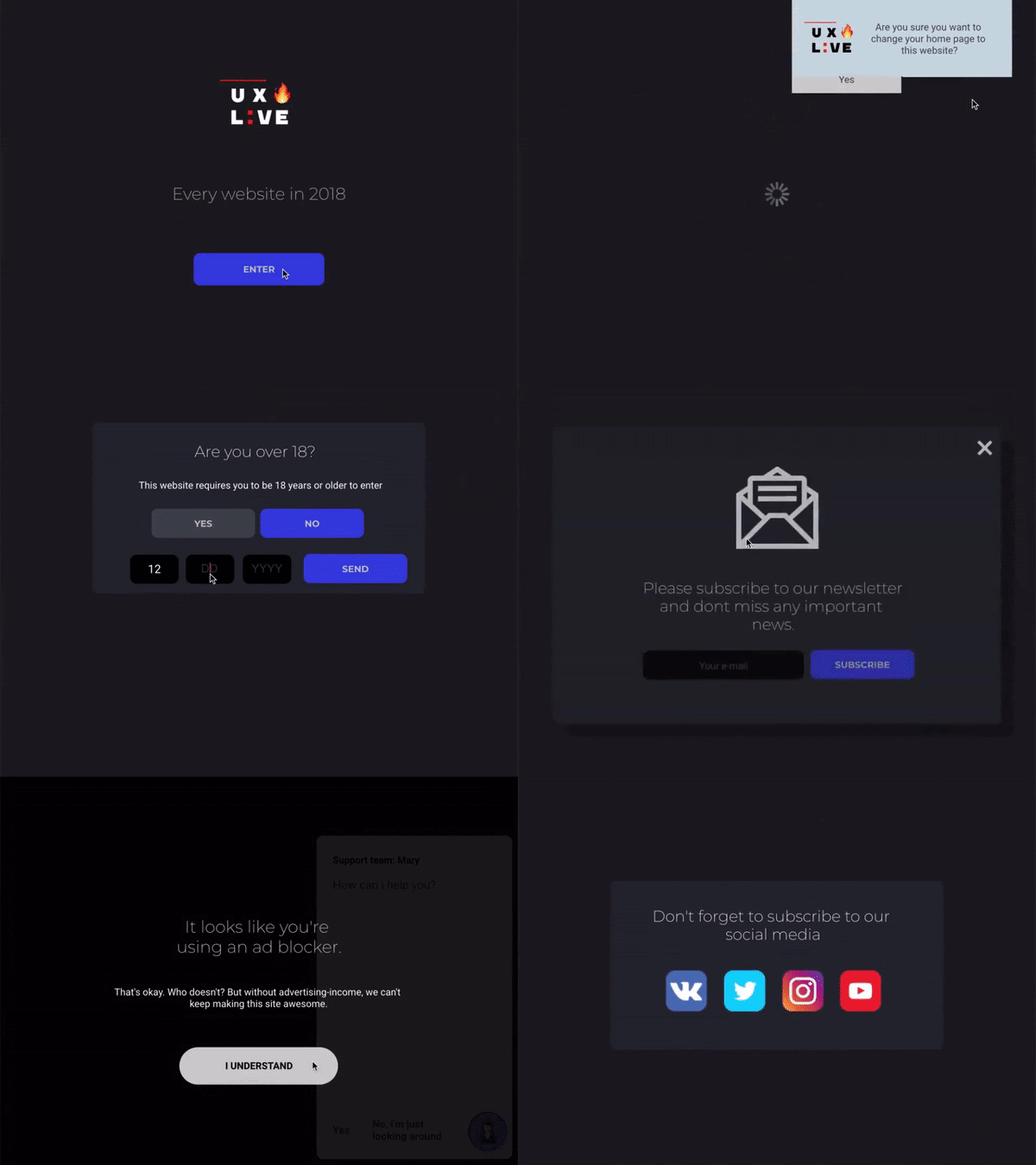
However, this opinion is not absolute. You run analytics for the company that built the website, and you say “Zach, we need all these things. They help our analytics and user profiling, allow us to engage with interested leads, retain information for following up, protect us and the user’s privacy with explicit consent, and allow for deeper conversations on social media!”
This is true, I would say. All of these things allow you to engage with your clientele in more efficient ways, and boost your business overall. You can embed chatbots to help connect with users live. You can embed feedback widgets to help improve your site from the user’s point of view. With the GDPR rolling along as it is, cookie consent bars are almost always a must now. Privacy policies are available, but legal teams recommend making users consent to privacy policies to cover the liabilities. Does your site have 18+ content? Be sure to add an age confirmation box. Better yet, why not just have users make an account with us so they can conveniently log in and not have to prove age later? The list goes on. In our mission to continue to bolster our site with tools to help us improve it, we start to slowly slip down the path of bloat. Let’s analyze this trend of bloat when it comes to websites and metrics, and see if there’s anything we can do to avert the course we are on in 2020.
A big part of this bloating principle comes from the modularization of the web. With the advent and propagation of CMS platforms, software developers are shifting their integrations away from pure code to embedding (if you’ve seen a <script> tag, that’s it). Instead of a trained web developer to integrate software like a chatbot, instead, one only has to copy/paste the <script> tag to import the 3rd party code, and BOOM! - the software is on your website. Sometimes there is some additional setup involved, but the point is that it’s getting very easy to connect applications, websites, and software together. The tools we can just “plug in” to our websites, regardless of CMS platform or pure HTML/CSS/JS, are only growing in number.
- Customer Feedback Widgets
- Chat Bots
- Live Chat Widgets
- GDPR Consent Checkboxes / Cookie Consent Checkboxes
- Privacy Policy Agreements
- Pop-ups Promotions
- Newsletter Signups
- Sales Funnel Intakes
- Heatmap Software
- Live Review Widgets
- “Allow Notifications” Browser Requests
- “Add to Home Screen” PWA Requests
- ...this list goes on…
Individually, all of these tools have “X” value, to you as the business owner. Feedback widgets allow you to improve your site with feedback from live browsers. Sounds great, right? Sales funnel intakes allow your team to intake leads into your sales cycle and nurture the sale. Sounds great too? Sure! Individually, all of these tools add value to your organization. However, there is a slippery slope when it comes to “stacking” these tools.
“Why not just gather all the data, metrics, feedback, and sign ups we can?” you might ask. Good question. From the business owner’s point of view, everything is just data and boosting your viewpoint of the populace that uses your site as a whole. However, this is the trap. The more you add, or “stack”, these tools on your website, the more bloated and interrupted the user’s experience becomes. This is an inverse ratio. Let’s look back at the GIF from above.
Before the user is allowed to even begin pursuing the point of their visit to the website, they must jump through hoops. They must agree to privacy policies, input their age, confirm their location, decline/accept newsletter signups, & decline/accept push notifications. We aren’t even looking at the fact that the site didn’t even function properly by the end. This, we can all agree, is a horrid user experience. But, from the owner’s point of view, all of these things have purpose. Who is in the right? The frustrated user or the analytical owner?
In all my years, I have never met someone who likes being sold to. Have you ever had to sit through a rough sales pitch, getting that cringe vibe pushing you away? Or have you ever had a pushy car salesman frustrate you out the door? Although sales benefit both parties in ideal situations (good/service < -- > currency), your website visitors are smart. Forbes asserts that we are subjected to between 4k-10k marketing messages a day. So our users, the people we walk by every day in our lives, know when they are being sold to. And what’s more, they know when they are being used.
I remember one time, years ago, I received a mailer claiming that I had the chance to win cash money, a jet ski, or a new car by just playing this scratch off from a local car dealership. I scratched it, and behold I won! Freaking out, I called the dealership, and they happily booked an appointment for me to redeem my winnings. I drove there the next day, arrived on a literal red carpet they had set up, and then went to a salesman. He had me produce my winning mailer, congratulated me, and then input my information into a program.
Turns out, the fine print said that the winning scratch off didn’t actually win me anything, but won me the opportunity to spin a wheel. Well, I spun that wheel and won, but it wasn’t a car, it was a $5 Walmart gift card. And then to even claim that, I had to signup for all the dealership newsletters and offers. Turns out that every mailer was a winner, and I had been fooled in a marketing ploy. I had spent time, effort, and mental excitement all for naught. And boy, was I mad. So from the point of view of the dealership, they were just casting wide, data-driven net to capture the 1% of people who would actually turn around to buy a car that day. But me, being part of the 95% who didn’t, is still to this day royally mad about that, and I vowed never to support the dealership with a purchase. I felt used by marketing, and the negative experience that came from that is lasting and impactful.
This is a macrocosm of what a user can experience on a bloated, naggy website. If they just want to find your opening hours, why should they have to click through popups, signups, notifications, and more just to gather that information? Your lawyers tell you to force them to agree to privacy policies, your sales team tells you to force them to try to sign up for a newsletter. You have so many tools available to you, and it is so easy to install, that in the whirlwind of “stacking”, you are concurrently degrading the entire user experience. At some point, a switch flips in a user’s mind that they are annoyed by the UX of the site, and they will “turn off”. At that point, it’s very hard to get them back.
The point of this argument is not to dissuade you from installing and taking advantage of the wonderful softwares out there to bolster your business from the web side. The point here is balance. Just like a seesaw, as “stacking” goes up with these tools, UX goes down on the other side. UI/UX Design & Development is an art, not an exact science, despite many groups trying to make it so. It requires a holistic approach to determine the User Experience from the beginning to the end, and to truly empathize with how the user feels using your website.
To alleviate this problem going forward, before you continue to add tools like chatbots, or push notifications, or pop-ups, go experience your site from a user’s perspective first. Roadmap what a fresh user experience would look like: how they got to your site, why they would come, what is their goal, what do/don’t they know? Consider the experience the user would have before any of the engagement prompts occur. Then, weigh the value added to your brand by having a tool as such against the negative, if any, it gives to the user. A/B test to see if your UX is improving or degrading, and don’t be afraid to acknowledge errors in your process and revise it.
Here are some good rules of thumb our team uses to help keep a healthy balance of the extra tools on top versus the UX:
- No more than 1 Pop-up per page
- No more than 3 Pop-ups per site
- Use cookies to prevent pop-ups from re-triggering to users who have seen it already
- Reformat your content to integrate CTAs in the flow rather than a disjoint pop-up, dialog, or modal
- Minimize prompting - this is when your chat software automatically says “Hello! Have you found what you are looking for today?” or something of the like. This is alright with a grain of salt, but the more prompting you have, the more you break your user out of the flow of the site that you have crafted for conversion
- Ask yourself if your site truly merits “Allowing Notifications” or “Adding to Home Screen” - this is a sacred permission that is easily abused, and easily revoked as well by the user. They invited you into your home once or twice, but that doesn’t mean you can knock down the door twice a day.
- Never prompt your site to become their homepage
- Hide social media triggers in the footer of your site - Social media links are merely “exit windows” for your users to leave your purpose-drive site to get lost in social media. You users are here for a reason, don’t give them a reason to leave.
- Don’t try to fight ad blockers - you will always lose and users would rather not use your site than disable their ad blocker
The conversation of “stacking” and “bloating” versus “UX” is an ongoing one. Every day, new tools are made and refined to help you improve what you do every day. However, this is a slippery slope, trading data, metrics, and analytics for how a user feels using your site. And at the end of the day, it’s those feelings that will push or pull a user against the sale, or the conversion. You want to be there for the user, without being pushy - and this is a principle akin to sales in any industry. Pity the user, and remember that they know when they are being sold to, and more so, when they are being used. As the late, great Uncle Ben Parker once said:
“With great power comes great responsibility”.
