
6 Sites that Blend Content & Design Wonderfully
At the VMD, we love narrative marketing. Narrative Marketing (evoked in frameworks such as StoryBrand), blends the engagement, acquisition and conversion with one of the oldest tools of communication: the story. If your business or the one you work for sells anything at all, narrative marketing will help you. Narrative marketing is just the content though. The delivery of said content is where the design gets to have its moment. Great design catches the eye, encourages User Flow, and works in parallel with narrative marketing by guiding the user through information in an engaging way, all funnelling towards the eventual decision to do business with you. By blending narrative marketing and great design, you can truly begin to affect the world with your brand in positive ways, and make more money doing it. Here are 7 websites that we think blend content & design quite wonderfully.
1. Slack
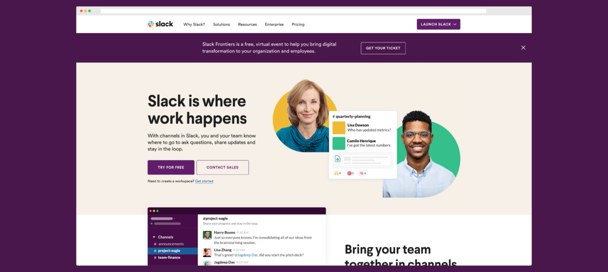
Slack is an application that allows teams to communicate over “channels” in a web-app or native mobile app, eliminating the endless, confusing email threads that we’ve all experienced. Slack also allows a huge amount of application integrations, like Zoom Google Drive. Slack uses clean, flat design to communicate clearly and focus on the words on their page. They keep the words short and sweet, only communicating what they need to effectively convince the browser in one pass that Slack can solve their problem. A clear call to action button in the top right corner obeys the “Z-pattern” that browsers’ eyes naturally follow. Learn more about the Z-pattern concept on UX Planet. Initial header copy and CTAs answer immediate browser questions and make it clear how to do business with them. Blocks of content break up the copy and help the user digest and process information as easily as possible. Design is clean and not distractive, but uses color and flow-breaking to highlight important interjections and calls to action, such as the purple strip near the end, invoking the success a user will feel by using the Slack product.
2. Spinx Digital
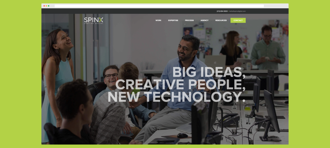
Spinx Digital is a digital marketing agency based out of Los Angeles. The Spinx site starts off with a media-rich environment with a bold, impactful headline. The following sections are laid in block design that allow easy digestion of information, which immediately begins to explain how Spinx can help your business. Recent work and social proof in the form of high-profile clients help establish authority in the space, and micro-animations & interactions act as visual candy to the user while maintaining focus on the content. Reveries, if you will. Sphinx clearly communicates their services in an engaging way and uses their brand colors to highlight the most important bits of information, helping to guide browsers while they scan the site. (Remember, people scan websites, they don’t read them!) Media and design do a great job of highlighting the information the browser needs to know without detracting from it. The site is not bloated with ‘exit signs’ that take the user off the site, and the final footer invokes a call-to-action after establishing a “plan” earlier before.
3. Square
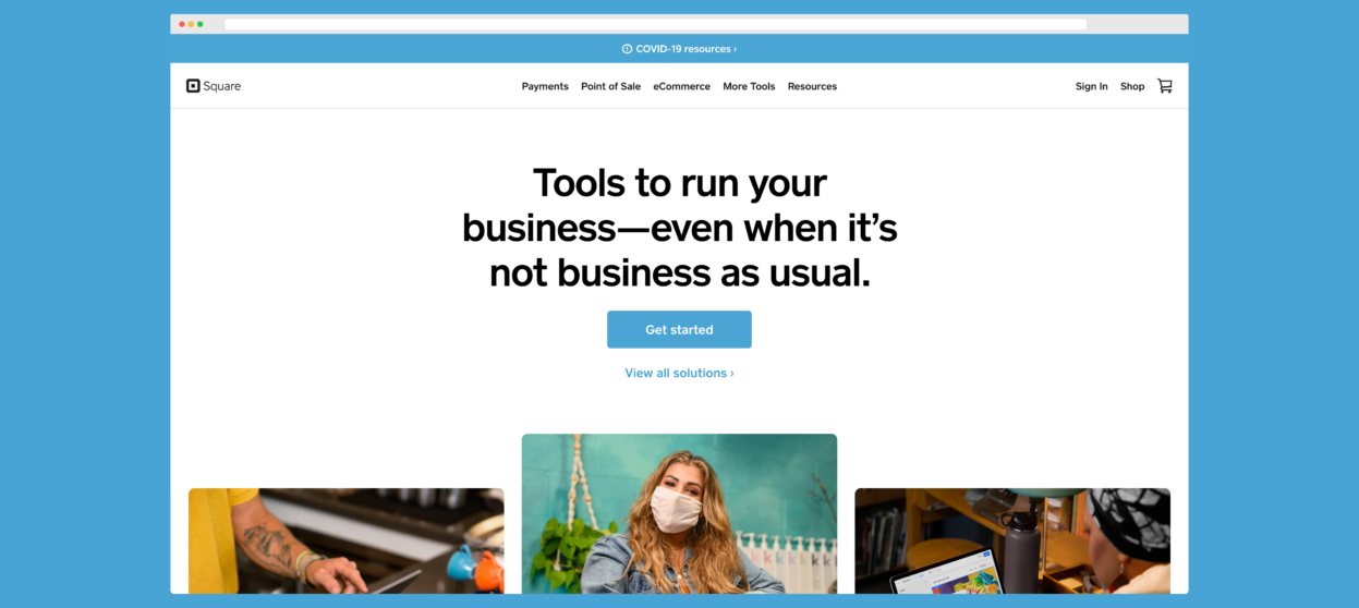
Square is a Point of Sale System that primarily allows merchants to accept credit card payments while mobile, but has evolved to a merchant services and mobile payment company. The Square site uses simple, bold colors to not distract from their impactful, heavy headlines. These headlines display narrative marketing by connecting with the browser in empathetic ways, such as acknowledging COVID-19’s effect on businesses most recently. Large, high-contrast CTAs keep it clear how to continue with Square. They explain their services in bite-sized chunks, and structure the following information in short, bold and direct messaging that continues to show how Square will solve the customer’s problem and help them thrive. They include a transitional call to action for browsers who are not ready to buy just yet. Text links and CTA buttons are consistent with branding, allowing the user to subconsciously connect and see a clear path to action. The footer houses all the necessary information for all other purposes, but the main content and design of the site focuses on the selling point, utilizing narrative marketing and clean, clear design to focus on what their message is.
4. Splice
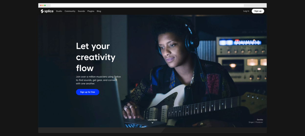
Splice started as a Sound Effects & Sample Web Library for Music Producers, but has evolved into a Plugin Store, a Collaboration Community and Sample Bank with a thriving community. Their site takes the “success” approach to narrative marketing, by focusing and highlighting all the great things that users could experience by using the Splice product. Media either empathizes with the archetype of a producer or helps to explain and preliminarily answer any “What does this look like?” questions. Company Endorsements and Social proofs give Splice the authority to earn the trust of the browser, and the simple, bold and rich design and flow mirrors the success wing of narrative marketing wonderfully. Reserved use of color allows media to pop and keeps space for the CTAs to really jump out of the flow and stay obvious. They also adjust the narrative script on each subpage, continuing to pull the browser through narrative transportation while explaining more in detail of each of their wings of products.
5. BoomTown
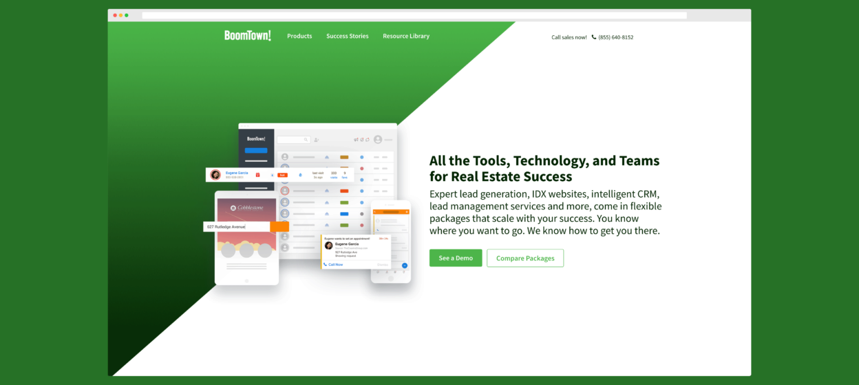
Boomtown is a real-estate software company with lead-generation, IDX integration, CRM lead management and more. We love this site because it does a great job of taking a complex topic and simplifying it to fit in a narrative marketing script. Sharp color gradients encourage eye-tracking flow through the initial header, leading to the bold CTA button that makes it clear how to engage with their sales team. Boomtown is reserved in their color usage, saving it for small highlights and splashes of accent color. Small, digestible sections of content explain the products and establish Boomtown as a guide in their space. The final call to action is enlarged to a whole section to effectively complete the micro-story on the homepage, showing the user the next step to achieve the success foreshadowed and alluded to through the page.
6. HotJar
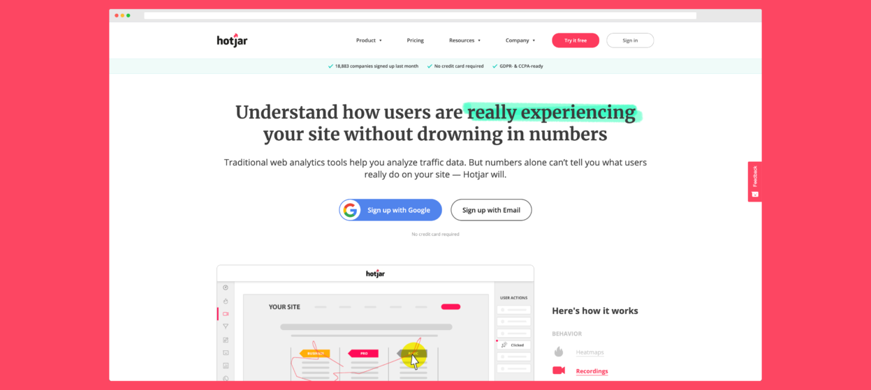
Hotjar turns traditional web analytics into a visual, easily accessible suite of heatmaps, visitor recordings, and analytics that allow you to understand user behavior on your site and optimize accordingly. Hotjar catches the users’ attention with a headline that immediately hits on what it can do to help them, following up with a CTA that pops in a color across the wheel from the brand flamingo red. Animated GIFs and bulleted lists help give insight into the product as supporting content as well. Hotjar hits almost all of the StoryBrand Framework’s 7 Parts, in very concise, direct bits. The site takes a complicated topic and successfully pares it down very well. Color is on-brand and is reserved for highlighting CTAs and helping the eye jump from section to section, as well as breaking up the copy. HotJar is a great example of how a complicated topic can be explained and pitched, evoking narrative transportation within a 30 second scan of a site.
There are over a billion websites in the world, and we have looked at only seven of them. However, there already seems to be a pattern following. While there isn’t necessarily a right answer to each situation, narrative marketing seems to have a design pattern that fits like a glove. Content that is clear, direct and doesn’t make the brain burn extra calories trying to understand it. Color is reserved for the CTA clickable links as well as accents that usually boost the flow of the copy as is. Media is used intentionally rather than spastically, and either explains a product or service visually, or evokes the positive emotion a person will experience by doing business with the company. Clear menu navigation and “sticky” CTAs in the menu bar that flow down as the user scrolls down minimize bounce rates and keep users engaged within the narrative transportation by seeing the one and only way to “get started”.
Modern design is a large facet as well - bold colors, flat design, accented vector graphics, and micro-animations/interactions keep the user interested and engaged while not detracting from the content and purpose of the site. Whether it’s by form, feedback, email or button, narrative marketed sites all keep the CTA clear and bold. You can’t miss it. Use of whites-space (or dark-space in dark-mode) cleans up the cluttered mess that websites had become in the past 10 years and gives the browser a pleasant browsing experience while allowing information to be given and processed, which in turn allows for more unique, fun and accented bits to be mixed in to the content. Simplifying your content gives you more room to allow design to support your words, rather than trying to just add something to break up the monotony.
While Narrative Marketing handles the words, it’s incredibly important to remember that design still has its place, but should be used to bolster the messaging, rather than be the focus in the first place. These websites do a great job of communicating a simple, clear message in an engaging way that helps the user understand why and how doing business with them will only be a great thing.
If you want your website to become a 24/7 selling machine, you need narrative marketing (e.g. StoryBrand!). But you also need a team that knows how to design synchronously to support your content and invoke the transaction. Everyone at the Virtual Marketing Directors lives and breathes StoryBrand & narrative marketing, and builds websites that turn browsers into buyers every day.
Click the button below to schedule a free 15 minute marketing assessment to see how you can rocket into growth and success!
Schedule your marketing assesSment